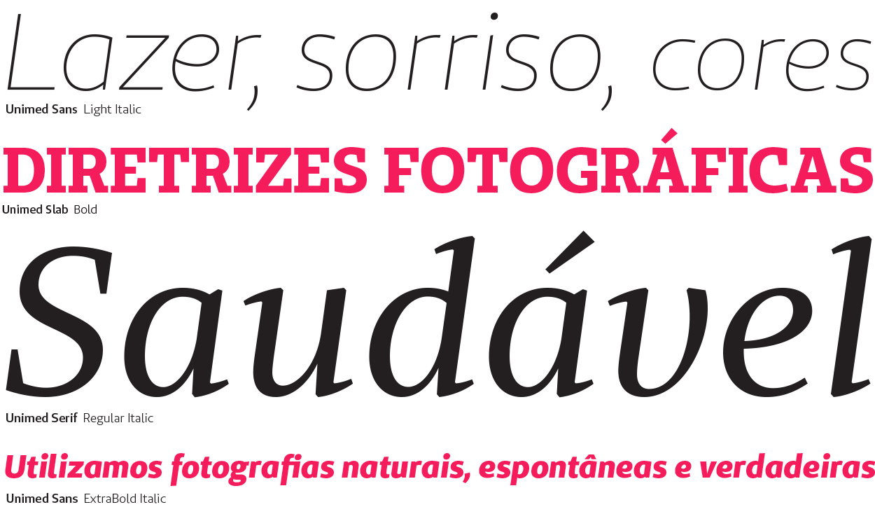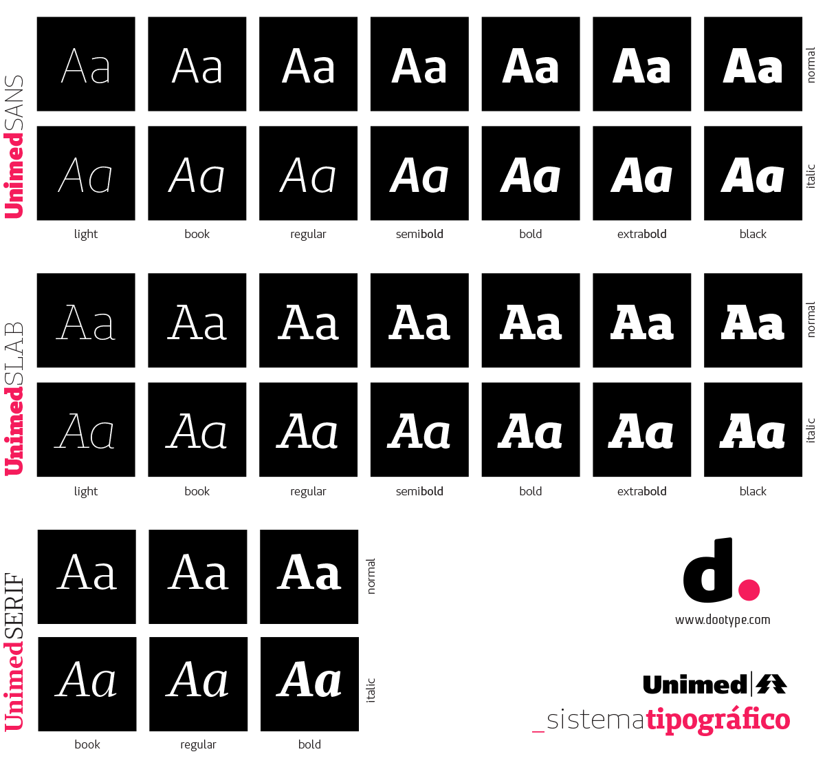
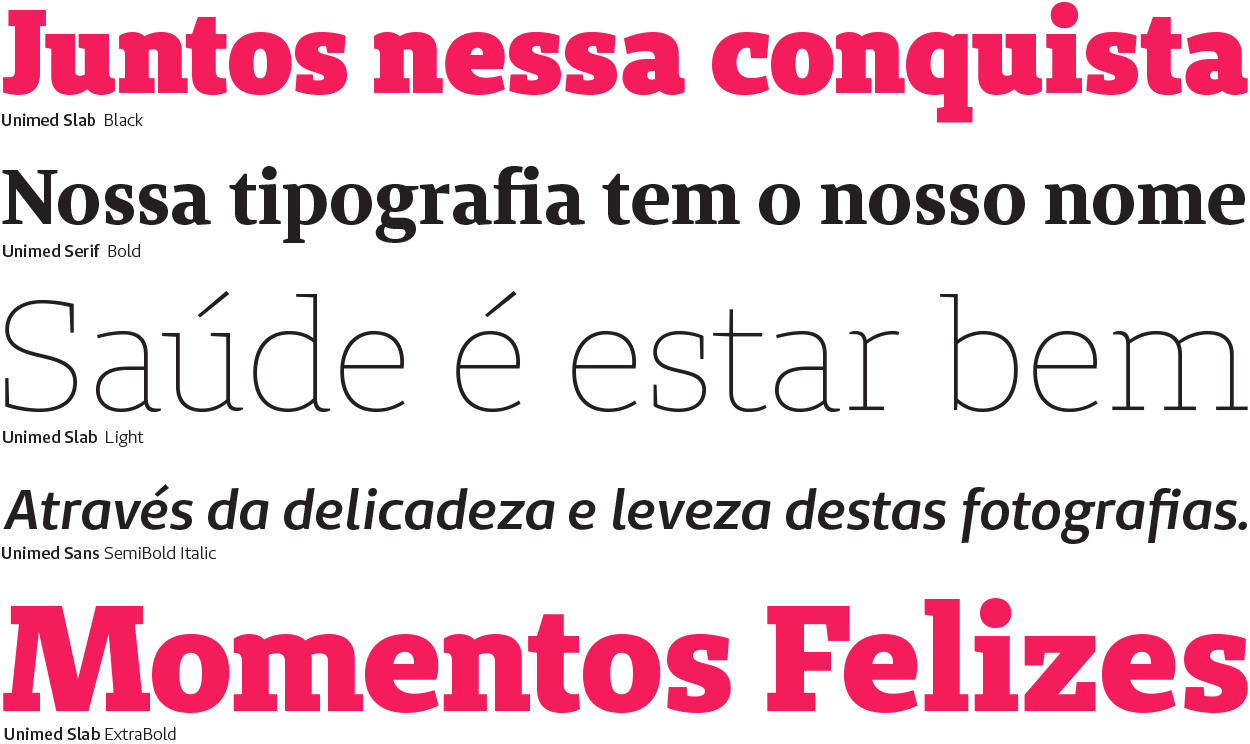
UNIMED SLAB
Designed to be used for display typography, the UnimedSlab font family features an outstanding personality. It has robust serifs and carefully optimized letter-spacing for blank space saving. With seven weights, from Light to Black and their italic types, it provides enormous versatility, for it allows the choice of the appropriate weight for each content hierarchy.
Designed to be used for display typography, the UnimedSlab font family features an outstanding personality. It has robust serifs and carefully optimized letter-spacing for blank space saving. With seven weights, from Light to Black and their italic types, it provides enormous versatility, for it allows the choice of the appropriate weight for each content hierarchy.
UNIMED SANS
The UnimedSans font family has a dual function: to be employed along with the Slab version when used in headings, as well as to be employed in short texts so that the Serif version is not overloaded. For best results when used in short body copies, four weights, ranging from Book to Bold, are recommended. The other weights have better use in large body copies.
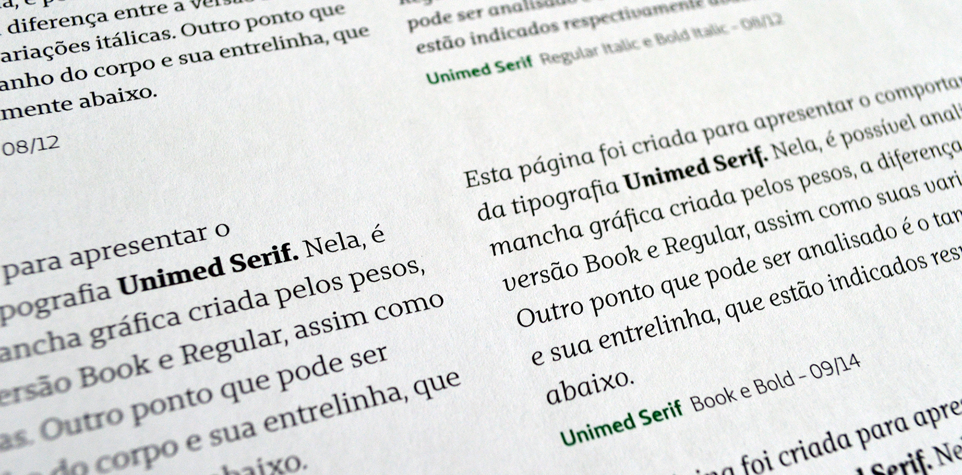
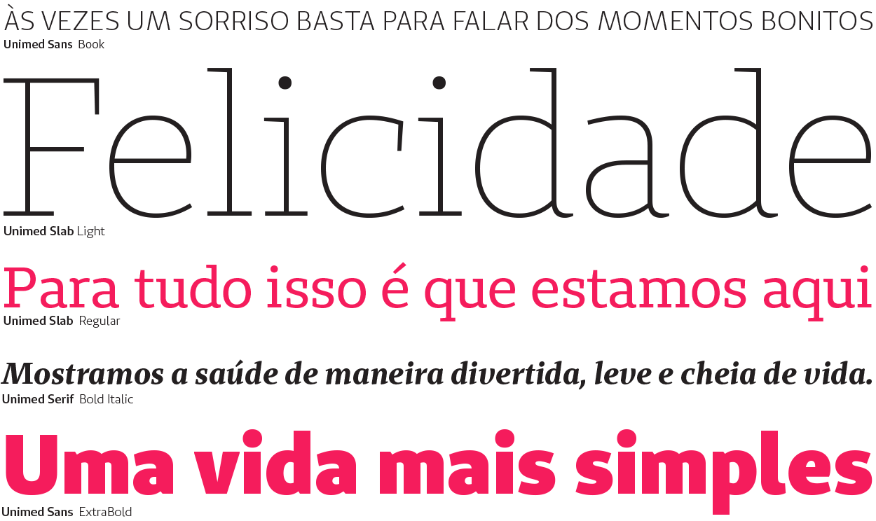
Printed type specimen - Unimed Serif
UNIMED SERIF
With three weights incorporated, the UnimedSerif font family has the essentials for creating materials with a large amount of text. The Book and Regular weights hold a slight difference between each other. The desired effect, as well as the type of paper and print, will have an influence when choosing one or another. The Bold version completes the font family and works as a support for items that need to be highlighted, in conjunction with their italics.
With three weights incorporated, the UnimedSerif font family has the essentials for creating materials with a large amount of text. The Book and Regular weights hold a slight difference between each other. The desired effect, as well as the type of paper and print, will have an influence when choosing one or another. The Bold version completes the font family and works as a support for items that need to be highlighted, in conjunction with their italics.